By Ivan Hadzhiev·
How to Design Premium Merch for Your Brand: The Full Playbook
There are two kinds of company merch. The first kind is a logo placed on a product: fast, safe, and instantly recognizable as merch. The second kind holds its own next to anything a real brand sells at retail: original graphics, deliberate color, premium blanks, and a point of view. Anyone can make the first kind. This playbook is about the second, and we are giving away the entire method: the non-negotiable basics, why taste is the real bottleneck and how to build it, where to actually look for inspiration, the design process that turns all of it into production files, and the honest role of AI in the middle. Use it to raise your own next drop, or bring it to us and we will run it for you.
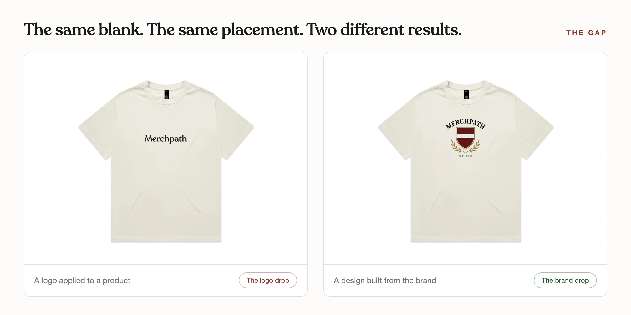
The gap between merch and a brand
Put a startup hoodie next to a hoodie from any brand your team admires and the gap is rarely the blank. It is everything around the blank: the graphic has an idea, the colors were chosen as a palette rather than defaulted, the branding is confident enough to be small, and the whole set looks like it came from one place. That is what retail-level means, and it is a design standard, not a budget tier.
The gap matters most for companies building something they are proud of. Your team wants to represent the thing they are making an impact with; what they will not represent is a walking ad. Merch that expresses the aesthetic of what you are building, in your own words and phrases, gets adopted as identity. Merch that just repeats the logo gets tolerated.
Closing the gap is a process, and none of it is secret. The rest of this playbook is the whole thing.
The floor: four basics before anything creative
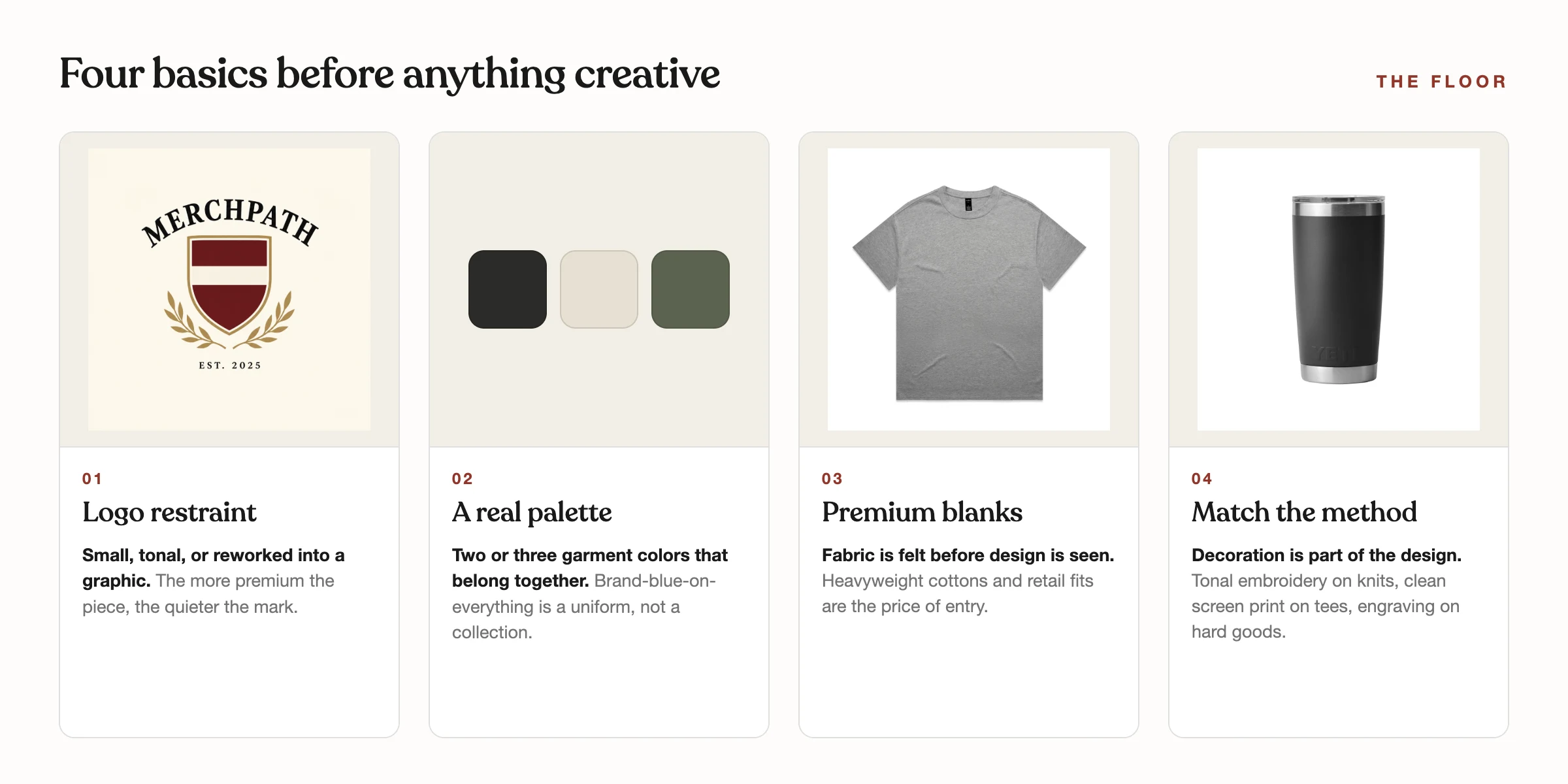
One: stop plastering the logo. A full-chest logo is the single most reliable marker of amateur merch. Shrink it, move it to the left chest or a sleeve hit, run it tonal, or rework it into something graphic. The more premium the piece, the quieter the mark.
Two: choose color like a brand, not like a template. Pick two or three garment colors that belong together and belong to you, and let the garment color do visual work the print does not have to. Brand-blue-on-everything is a uniform; a considered palette is a collection.
Three: premium blanks are non-negotiable. Fabric is felt before design is seen, and no graphic survives a thin, boxy-in-the-wrong-way blank. Heavyweight cottons, retail fits, and elevated hardware are the price of entry for anything you want treated as premium.
Four: match the decoration to the piece. Tonal embroidery on knits and premium layers, clean one-to-three-color screen print on tees and fleece, engraving on hard goods. The decoration method is part of the design, not a checkout option.
Taste is the actual bottleneck
Past the floor, what separates strong merch from forgettable merch is taste: the ability to look at two options and know which one is better before you can explain why. No process substitutes for it. A team with taste and no process makes slow good work; a team with process and no taste makes efficient bad work.
The good news is that taste is buildable, and the mechanism is unglamorous: volume of good references. People with taste have simply looked at more excellent work, more attentively, than people without it. Start a reference folder today, add only pieces that stop you, and write one line about why each one works. Fifty entries in, your eye is different.
And be honest about where you are. If nobody on the team trusts their own eye yet, that is not a character flaw, it is a staffing gap. Borrowing taste, from a designer, a design-literate friend, or a service like ours, is faster than pretending.
The inspiration engine
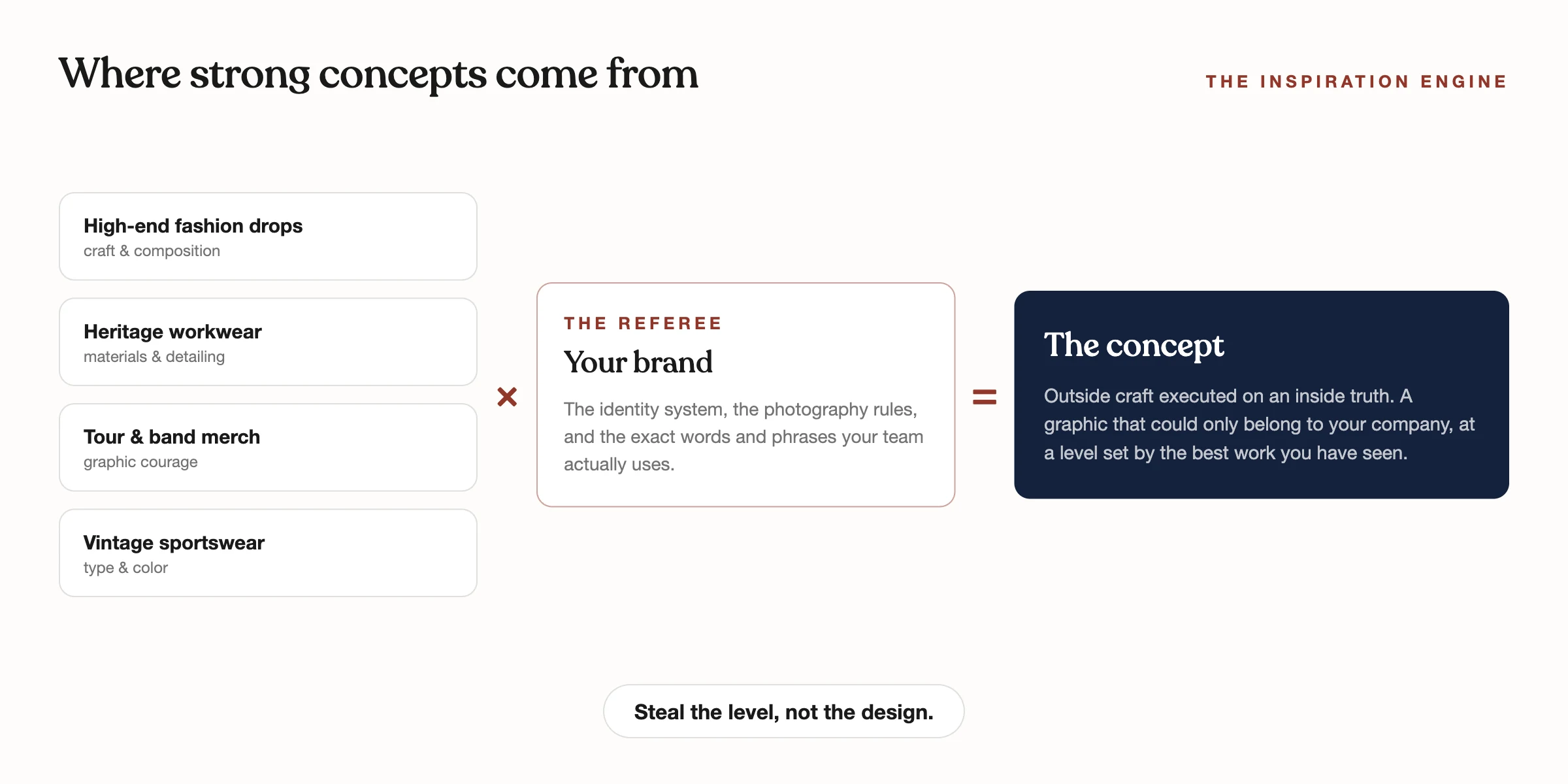
Great merch is never designed from a blank page, and it is never designed from other companies' merch either. Looking at merch to design merch is how the whole category converges on the same three ideas. The references that raise the ceiling come from outside: high-end fashion drops, heritage workwear, tour and band merchandise, vintage sportswear, movie and label graphics, old packaging and signage. That is where the composition ideas, type treatments, and color courage live.
The second source is the brand itself, and it is the referee. Pull the identity system, the photography rules, the taglines, and, most valuable of all, the exact words and phrases the team actually uses. A graphic built on a phrase your company genuinely says will land harder than any borrowed aesthetic, because it is true.
The rule that keeps all of this honest: steal the level, not the design. A reference sets the bar for craft, composition, and confidence. The content, the words, the marks, the meaning, has to be yours. When those two sources cross, an outside reference executed on an inside truth, that is where the good concepts come from.
The process: from references to production files
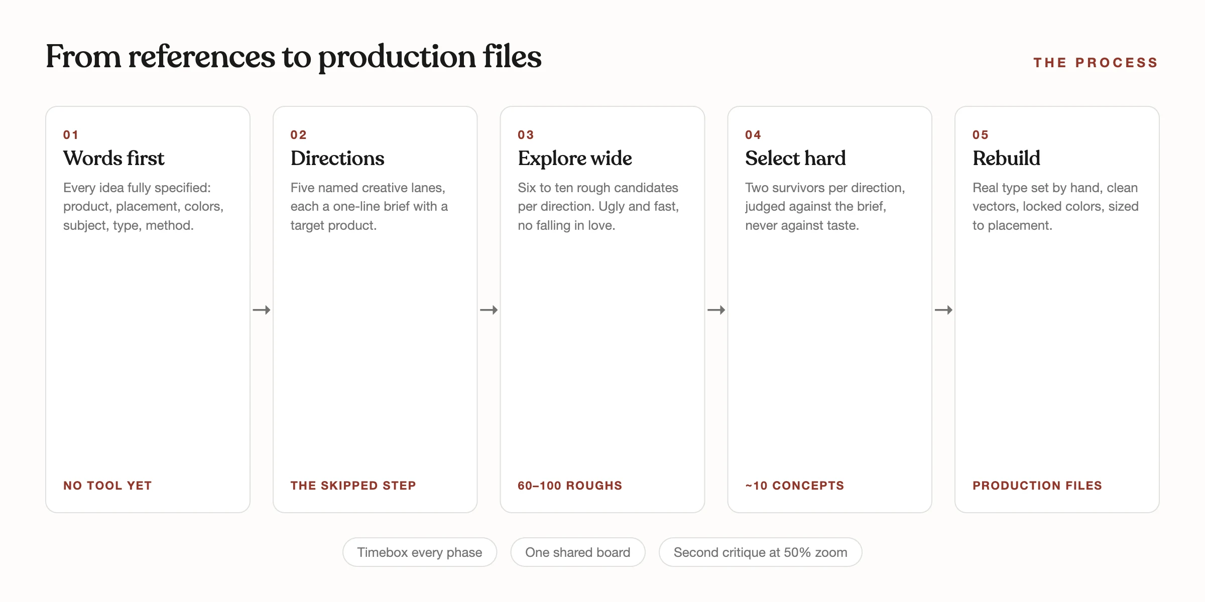
Write every idea down in words before opening any tool: the product and placement, garment color, a maximum of three ink colors, the one subject the graphic is of, what the type says, and the production method. If you cannot fill that in, the idea is not ready.
Then work in phases and do not skip the second one. First, brief: the brand's three adjectives, the reference board, the phrases. Second, directions: around five named creative lanes, each a one-line brief with a target product, agreed before anyone generates or sketches anything. This is the step everyone skips and it is why most exploration produces forty disconnected images. Third, explore wide, ugly, and fast: six to ten rough candidates per direction, no polishing, no falling in love. Fourth, select hard: keep the two strongest per direction and critique against the brief, never against personal taste. Fifth, rebuild everything that survived properly: real typography set by hand, clean vectors, locked colors, artwork sized to its exact placement.
The rules that hold it together: timebox every phase and move when the box ends, one shared board with one naming convention, and a second critique pass at 50% zoom, where weak composition has nowhere to hide.
What this produced on a recent sprint
We recently ran this exact playbook for an infrastructure startup with a studio-built identity and a strong point of view. The output was a set of original graphics that expressed the aesthetic of what the company is building, certification-style typography built on their flagship tagline, their infrastructure drawn as civic line art, quiet workwear detailing for the premium layers, all carrying the exact words and phrases their team uses, on heavyweight and retail-brand blanks.
The result read like a brand drop, not a merch order: five named directions, roughly eighty rough explorations, ten surviving concepts, each mapped to a specific garment, colorway, placement, and production method. The cuts taught as much as the keeps; anything that felt styled rather than found, or industrial rather than consumer, went, because the brief said so.
That is the difference the process buys. None of those graphics existed before the sprint, and all of them belong unmistakably to that company.
Using AI without letting it design
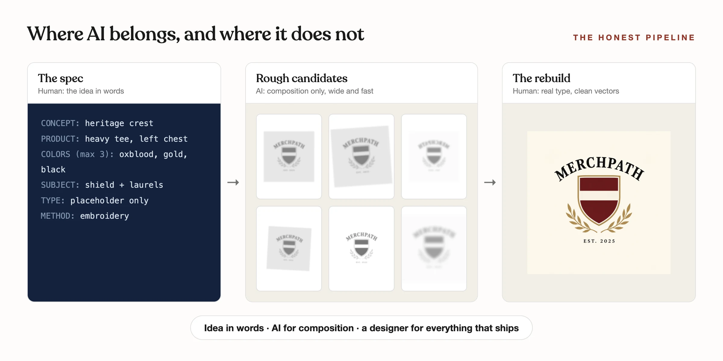
AI image tools have flooded merch design, mostly with generic graphics and melted typography. Used with discipline they accelerate exactly one phase, exploration, and nothing else. The pipeline that works: the idea fully specified in words first, AI to generate rough compositional candidates against that spec, and a human with real design tools rebuilding everything that ships.
The hard limits: AI-rendered type never survives, every word gets deleted and re-set by hand in real typefaces, two per project. Flat one-to-three-color art traces cleanly into vectors for screen printing and embroidery; photographic concepts skip vectors and print raster. And AI cannot make taste decisions, which, as covered above, is where the whole game is decided.
The shortcut: commissioned design, not logo placement
Everything above is yours to run. A motivated team with a decent eye can execute this playbook on their next drop and the result will be visibly better than what they made last time.
And this playbook is also, literally, what our design service is. The distinction we would draw with any client: most custom merch is logo placement, your mark applied to products, and we do that well when it is the right call. The design service is the other thing: a designer creating original graphics that did not exist before, built from your brand system and your own language, refined through the process above, and delivered as production-ready files mocked on premium blanks in a lookbook you can order from directly, with live pricing and a minimum of just 12 pieces.
If the taste and the hours live on your team, take the playbook and run. If they do not, that is exactly the gap the sprint fills.
Frequently asked questions
- How do you design merch that looks premium instead of promotional?
- Four basics set the floor: a small or reworked logo instead of a full-chest print, a deliberate two-to-three-color garment palette, premium heavyweight blanks, and decoration matched to the piece. Beyond the floor, premium comes from original graphics with an idea in them, built from the brand's own language rather than the logo repeated.
- Where should we look for merch design inspiration?
- Outside the merch category: high-end fashion drops, heritage workwear, tour merchandise, vintage sportswear, and old packaging and signage, crossed with your own brand system and the exact phrases your team uses. The rule: steal the level of craft, never the design itself.
- What is the difference between custom merch and merch design?
- Custom merch usually means logo placement: your existing mark applied to products. Merch design means commissioning original graphics that did not exist before, created by a designer to fit your brand system, then produced on premium blanks. The second is what makes a collection read like a brand.
- Can AI design our merch?
- AI can accelerate rough exploration when every idea is specified in words first, but it cannot pick directions, critique against a brand, set typography, or produce production-ready art, and it has no taste. Treat it as a sketching tool inside a real process, never as the designer.
- What do we get from a merch design sprint?
- Around ten refined original concepts chosen from sixty to a hundred explorations, each mapped to a specific garment, colorway, placement, and production method, delivered as production-ready vector files and mocked on real in-stock blanks in a lookbook you can order from directly. Minimums start at just 12 pieces.
See how we work